Transparent business practices, social-conscious brands, and being design-focused.

For brands that operate solely online, namely fashion retail e-commerce websites, it is important for them to employ a strong sense of branding and a stellar user experience in order to differentiate from the masses. Since the online marketplace is heavily saturated with products, each desperately vying for online customers, it is easy to get lost and confused in the midst of looking for the right product and website to shop at.
Companies such as Fab and Everlane are great examples of online e-commerce websites that have found great success, traction, and customer loyalty. What all of these online brands have in common is their user-centric focus, a strong understanding of their target audience, and simplicity in navigation that results in a delightful experience.
Fab
Let’s start with analyzing Fab, one of the fastest growing e-commerce retail sites based in New York.
In February 2013, Fab has reached a staggering number of 11 million users, a major jump from 175,000 members at the time of their launch in June 2011. What attributed to their success? Fab CEO, Jason Goldberg, wrote in his personal blog (betashop.com) about his ideas for the creation of Fab. He noted that there was a lack of a “web-native e-commerce brand today for design products, particularly at discount pricing.” Goldberg understood that there was a niche market for this need and set out to execute his vision. Fab delivered an exceptional user experience that contrasts with the typical online shopping experience that Goldberg referred to as “uninspiring and overwhelming”.
User Experience Design
Fab understood that their target audience are design-conscious individuals and they are on the website to browse and purchase products catered to their sense of style and interests. Unlike other e-commerce websites, Fab is membership only, easy to use, and truly showcases each product as its own unique entity. By taking a look at their homepage, it looks more like an editorial spread than a site that is filled with tables of products on sale. Large, modular-like grids are used to display promotional items and each fully saturated image corresponds back to Fab’s brand identity. Each picture is engaging and truly does the products justice and encourages product discovery throughout the site. They make it easy by having an excellent refined filtering system. Users can filter by: type of product, designer, price, color, popularity, and what’s featured.
By taking a look at their individual product page, the layout is designed in a way to guide the user into understanding more about the product, shipping information, as well as a time stamp on the duration of that discount offer (enticing users to quickly make the purchase).

Fab isn’t just a medium where people shop for things. They can come here to leisurely and happily browse. Fab’s website is designed more like a magazine filled with eye-catching products that can be saved and shared.
Shifts in Consumer Behavior
Fab is also a company that embraces social media and an early adopter in using technology to their advantage. In addition to their online website, Fab is actively present on major social media channels and have their own iOS and Android apps available on mobile devices. Fab does a great job in staying consistent and compatible throughout all their platforms. Now that consumers are spending more time on mobile, Fab’s quick strategy to design a mobile app worked to their advantage. VentureBeat reported that about “one third of Fab’s traffic and sales each day come from mobile”. This number is astounding and reflective of how the modern consumer approaches online shopping. Fab’s mobile application was designed solely with the persona of a “mobile shopper” in mind. As Goldberg describes Fab, he wanted to create a shopping experience that is “curated, social, exciting, and addictive.”


Everlane is a luxury clothing and design manufacturing company founded in 2010. Their mission is to provide high quality clothing at a relatively low price point by eliminating the middleman cost, which ultimately results in a better and more unique shopping experience for customers. Their philosophy and mission speaks loudly and is translated through their online web presence and design. Everlane specializes in luxury essentials for men and women such as the basic tee, the oxford shirt, sweaters, belts, and scarves.

Above is a screenshot of Everlane’s homepage. Their design embraces simplicity, simple and elegant typography in black and white, and guides the user in experiencing their journey on the website.
First and foremost, Everlane reminds the viewer about what their company is most proud of: their completely transparent business practices. This message is prevalent throughout their website and seamlessly educates the user in understanding where the products came from and the type of materials used in the making of each piece of clothing. By doing this, Everlane is doing something truly disruptive, and differentiates themselves from competing brands. Everlane values their customers and believe that this open communication will enhance their relationship.

Simplicity in design

Above we see an example of how Everlane displays their basic tee products to the consumer. With only 3 photos shown in a row, it makes it easy for the eye to glance through. Upon hovering over an image (eg. the first picture of the white tee), we get a close-up detailed shot of the product as well as sizing options. Below each image, in simple type, we are given the product model name and the price.
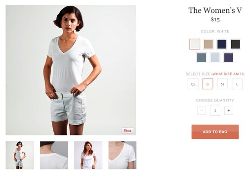
On the specific product description page above, users are given 5 different viewpoints of the shirt and an example of how the shirt looks worn on a person. The varying color options are displayed in a visually appealing palette that is also simple in design. The “Add to bag” button is large enough to capture the consumer’s attention but isn’t obstructively intrusive in an alarming way. Using box-like and large icons to refine the filter options is simpler than a drop-down menu. Also, Everlane has made their product images shareable, but instead of the typical Facebook, Twitter, Pinterest options, they have opted to just Pinterest. Why may this be? Perhaps it is because Pinterest is a site that serves to be visually appealing and harbors many inspiring fashion photos whereas sharing on Facebook and Twitter may not be as impactful.

Staying true to what they believe in
Last Thanksgiving, Everlane made a bold statement on their website saying they will not participate in the Black Friday sales event. By making this stance, Everlane is showing the public what they truly care about and that they are so firm on their beliefs that a day of monetary gain can’t waver their opinion. Knowing this adds to the user experience about the Everlane brand. The company makes sure to attract people who share their views and they have done a great job in building this community following.

Fab and Everlane are companies that both understand the importance of strong brand design and aesthetic. Lessons we can take away from Fab and Everlane:
1. Understand your target audience and tailor the user experience design to fit their needs
2. Create simple and useful filtering options
3. Ensure uniform design among all channels to maintain consistency
Their simplistic user experience paired with unique design elements have garnered them much success online. Fab and Everlane are portrayed as high-quality brands.
References:
http://venturebeat.com/2012/10/11/fab-mobile-do-over/
http://techcrunch.com/2013/02/05/fab-hits-11m-members-sales-up-300-percent-in-january/